Introduction
Customer churn refers to the measure of how many customers stop using a product. This is especially prominent in subscription-based business models. Many businesses measure churn using churn rate, the rate at which customers stop doing business with a company. A high churn rate really is the beginning of the problem but in order to obtain proper insights, we have to dive a little bit deeper into the data!
Objective
Today, I will be diving into a dataset from a telecommunication company. I obtained the dataset from datacamp. I will be analyzing to see why customers are churning, what the churn rate is, and other contributing factors to customer churning. I will be using tableau to create multiple data visualizations in order to gain insights that I can turn into actionable solutions.
Exploratory Analysis
Firstly, I checked the data to see if all of the columns and rows were properly formatted and labeled.
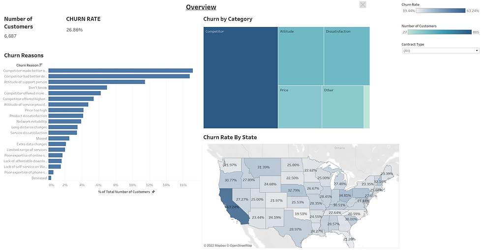
Then I changed the Churn Label column into a measure by creating a calculated field (Churned) where I used an IF statement to calculate 1 if churn label was "Yes" and 0 ELSE. This will be needed to calculate the Churn Rate, which is the number of churned customers/number of customers.
After figuring out the churn rate, I dived into finding out the reasons why customers are churning by creating a bar graph indicating the reasons and number of customers per reason. I also created a tree map showcasing churn by category.
Lastly, I created a map, to evaluate churn rate by state.

Deeper Analysis
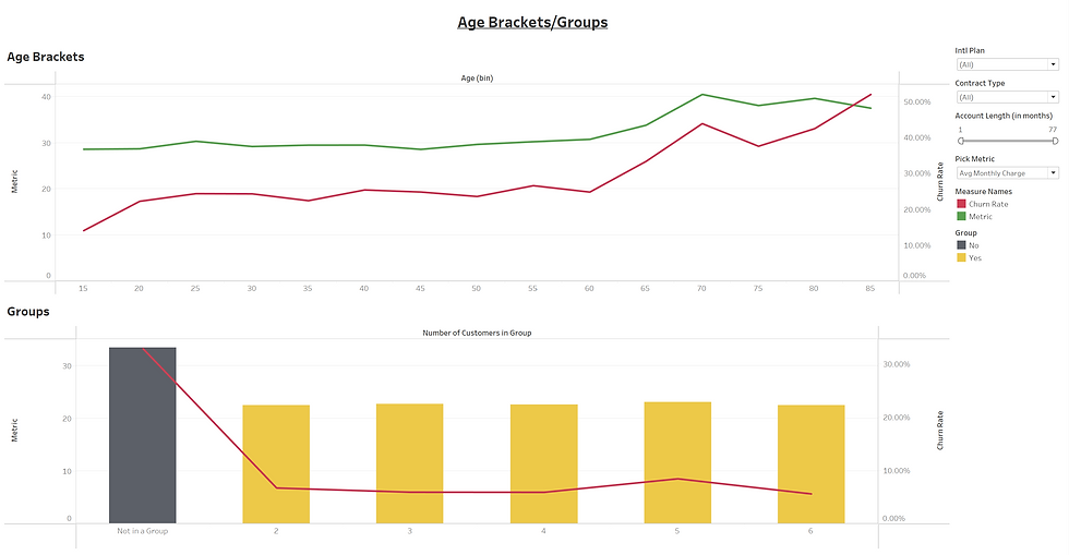
In this part of the analysis, I wanted to find out if demographics were a key factor in the churn rate. So I created 2 dual axis graphs where one side depicted the churn rate and another side was the metric. The metric includes 3 options, which are avg monthly charge, number of customers, and avg customer service calls. The graphs change based on what metric you choose.
I used two measure values which are age and number of customers in groups. I divided the age into intervals.

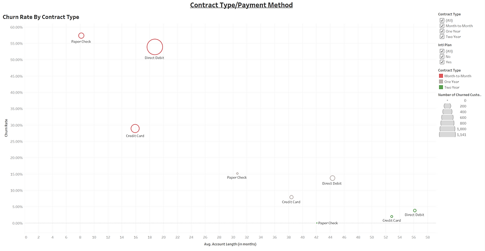
Now I looked into if the type of contract customers had any effect on the churn rate. So I created a scatter plot to compare the churn rate and contract type. The size of the point indicates the number of churned customers.

Lastly, I wanted to end by seeing if having a data plan and an international plan had an effect on the churn rate. To measure this, I created multiple bar graphs comparing the churn rate with having a data or international plan. I also did a monthly data breakdown, breaking up customers in terms of their data usage and evaluating the churn rate.

Key Insights
The main reason Databel's customers churn is due to competition and customer service.
The churn rate increases drastically in customers over 70.
Customers not in a discounted group have the highest churn rate at 30%.
Customers on a month-to-month contract with an average account length of fewer than 22 months have the highest churn rate close to 55%.
Customers on an international plan who are not active have the highest churn rate at 71.19%.
Customers who are internationally active but do not have an international plan have a 40.34% churn rate.
Recommendations
Databel should contact customers who have an international plan but are not active and propose them to downgrade their plan. This will lower their avg monthly charge resulting in improved customer satisfaction and could result in fewer customers churning.
Databel should also contact internationally active customers who don't have an international plan and propose to enroll them in one. This should result in a decrease in avg monthly charge since those customers are not accumulating extra international charges. This will result in fewer customers churning.
Lastly, Databel should persuade customers on a month-to-month contract to switch over to longer-term contracts by offering incentives to convert their contract type.
Thank you for reading my article, I hope you enjoyed my analysis and you can find the full interactive story on my tableau below.
Comments